LinkedIn Text Formatting Not Working? Here Is What Actually Broke
You bolded your LinkedIn post, it looked right in the composer, and then something went wrong. A colleague says it shows as empty boxes. Half the letters in one word came out styled and the other half did not. Your headline refuses to save. Or it all looks perfect and you quietly wonder whether anyone can actually search for you anymore.
Almost every article on this topic answers a different question: how to make text bold. This one answers why yours broke. The short version is that LinkedIn is rarely the thing at fault. The characters themselves are being used for a purpose the Unicode standard explicitly tells you not to use them for, and every failure below follows from that one decision.
Start here: find your symptom
Match what you are seeing to the row below, then read the section it points to.
| What you are seeing | What actually broke | Can you fix it? |
|---|---|---|
| It looks fine to you, but a reader says it shows as blank boxes | That reader's device has no font containing the characters you used | Not from your side. Keep anything important in plain letters |
| Some letters in a word styled, others stayed plain | Those specific letters were never assigned in the block your converter used | Yes. Switch to bold sans or bold serif, which are complete |
| Your headline will not save, and you get an invalid characters error | The headline field appears to reject stylized Unicode at submission | Yes. Retype the headline in plain characters |
| Formatting vanished when you pasted from Google Docs or Word | The post composer accepts text content, not rich text runs | Yes. Convert before pasting, or write in the composer |
| Ctrl+B does nothing at all | There is no formatting toolbar in the post composer | Not a bug. See the next section |
| A reader using a screen reader said your headline was missing | Most screen readers skip these characters silently | Yes, and this is the one most people never find out about |
Why there is no bold button in the first place
LinkedIn runs two different editors, and this is the single most useful thing to understand about the whole problem.
The article editor has genuine rich text. LinkedIn's own help documentation says you can "bold or italicize any text", create "ordered or unordered lists", add blockquotes, dividers and code snippets when you publish an article. That is a real formatting toolbar producing real markup.
The post composer has none of it. LinkedIn's help page on posting updates lists what you can add to a post: photos, videos, emojis, events, celebrations, job postings, polls, documents. Text formatting appears nowhere on that page. The same page confirms the 3,000 character limit for a post.
So Ctrl+B doing nothing is not a bug and not a permissions problem. The feature has never existed in the post composer, which is why an entire industry of workaround tools grew up around it.
What the converters are actually doing to your text
When you run a sentence through a LinkedIn formatter, nothing is being styled. Each letter is being swapped for a completely different character that happens to look bold.
Those replacement characters come from a Unicode block called Mathematical Alphanumeric Symbols, running from U+1D400 to U+1D7FF. They exist for mathematics, where a bold A and a plain A are two different symbols with two different meanings rather than one symbol in two weights.
The Unicode Consortium is direct about the misuse. From Chapter 22 of the Unicode Standard:
Characters from the Mathematical Alphanumeric symbols block should not be used to represent styling of nonmathematical text.
The same chapter explains the reasoning: "In any given document, these characters have distinct, and usually unrelated, mathematical semantics." Unicode Technical Report 25 repeats it: the block is "intended for use only in mathematical or technical notation" and not for non-technical text.
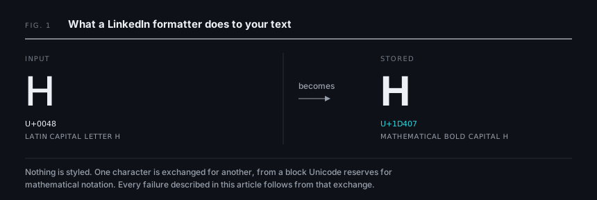
This matters practically, not just pedantically. Every failure in the symptom table above happens because software downstream of LinkedIn treats those characters as what they are, which is mathematical notation, rather than what you meant them to be.
The 24 letters that have no styled version at all
This is the answer to the most confusing symptom, where one word comes out with a mix of styled and unstyled letters.
Twenty four positions inside that Unicode block were deliberately left empty. The glyphs already existed in an older block called Letterlike Symbols, so Unicode left holes rather than encoding them twice. UTR 25 describes them as "explicit unifications with the characters in this block and corresponding holes."
The holes are not random. They cluster in the decorative styles:
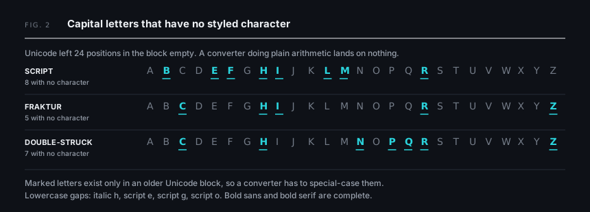
| Style | Letters with no character at the expected position |
|---|---|
| Script capitals | B, E, F, H, I, L, M, R |
| Fraktur capitals | C, H, I, R, Z |
| Double struck capitals | C, H, N, P, Q, R, Z |
| Lowercase | italic h, script e, script g, script o |
A converter that does simple arithmetic on character codes lands on an empty position for those letters. A well built one substitutes the correct character from the other block. A poorly built one outputs nothing usable, and you get a hole in the middle of your word.
Italic lowercase h is the one that catches most people, because it is missing from mathematical italic and English is full of it. If you have ever italicized a word and watched one letter stay upright, that was this.
The practical fix is to stay with bold sans serif or bold serif, both of which are complete alphabets. Script, Fraktur and double struck are where the gaps live. Checking this before you publish is exactly what a preview is for, and a free LinkedIn text formatter that renders every style family against your own sentence will surface a broken letter faster than converting the same line six times to find out.
Where formatting is allowed, and where it is refused
LinkedIn does not treat every field the same way, and nobody publishes this as a single view. Here it is.
| Surface | Real formatting | Unicode substitution | Limit |
|---|---|---|---|
| Post body | No | Accepted | 3,000 characters |
| Comment | No | Accepted | Not documented by LinkedIn |
| Headline | No | Reported to be rejected | Not documented by LinkedIn |
| About and Experience | No | Accepted | Not documented by LinkedIn |
| Article | Yes, full toolbar | Not needed | 125,000 characters |
| Newsletter | Yes, uses the article editor | Not needed | Article infrastructure |
| Connection request note | No | Accepted | 200 characters |
| InMail | No | Accepted | 1,900 body, 200 subject |
Two notes on that table, because accuracy here is worth more than confidence.
First, the widely repeated figures for the headline (220) and the About section (2,600) do not appear on any LinkedIn help page we could locate. They are community consensus rather than documentation. The comment limit is worse: three different numbers circulate, between 1,000 and 1,750, and LinkedIn documents none of them. Treat any article that states these as fact with suspicion, including the ones that rank first.
Second, the connection request note is officially 200 characters, with free accounts limited to three personalized invitations per month. The 300 character figure repeated across most of the internet is out of date.
The headline that will not save
If your headline throws an error along the lines of saving failed because there are invalid characters, stylized Unicode is the likely cause. This behaviour was reported in August 2024 and appears to affect the headline field specifically, while About, Experience and posts continue to accept the same characters.
We want to be straight about the evidence here: this rests on a single practitioner report rather than a LinkedIn announcement, and LinkedIn has published nothing about it. It takes thirty seconds to verify for yourself. Paste a styled headline, press save, and see what happens. The fix either way is to retype the headline in ordinary characters.
What screen readers actually do, which is not what you have been told
You have probably read that screen readers announce fake bold as a stream of "mathematical bold capital A, mathematical bold small b". That claim is repeated everywhere. It is also mostly wrong, and the truth is more damaging to your post than the myth.
Accessibility practitioner Adrian Roselli ran version specific testing in March 2025, updated in September 2025, and published the full matrix:
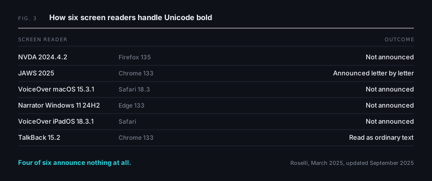
| Screen reader and browser | What happens to fake bold and italic |
|---|---|
| NVDA 2024.4.2 with Firefox 135 | Not announced at all |
| JAWS 2025 with Chrome 133 | Each letter announced individually, with case and style |
| VoiceOver on macOS 15.3.1 with Safari 18.3 | Not announced at all |
| Narrator on Windows 11 24H2 with Edge 133 | Not announced at all |
| VoiceOver on iPadOS 18.3.1 with Safari | Not announced at all |
| TalkBack 15.2 with Chrome 133 | Announced as ordinary text |
Only one of the six reads it letter by letter. Four of them say nothing whatsoever. Since NVDA and VoiceOver together account for roughly three quarters of screen reader usage, the most common outcome is not that your headline gets mangled. It is that your headline does not exist.
Roselli's earlier 2021 testing produced a different distribution again, which is its own finding: the behaviour is not just inconsistent between tools, it is unstable between versions. You cannot design around it.
There is a second failure almost nobody writes about. A commenter on that article who uses a refreshable Braille display reported that these characters arrive as question marks or as a placeholder saying the character cannot be rendered, and under some configurations expand into their full Unicode code point names. A standard Braille display has forty cells. One styled word can consume the entire display.
The W3C's cognitive accessibility guidance points the same direction, advising authors to avoid unfamiliar symbols in text because they "are likely to be read incorrectly by text-to-speech tools". Worth being precise: that is supplemental guidance, not a WCAG success criterion, so using Unicode bold is not a conformance failure. It is simply a bad outcome for real readers.
The irony is hard to miss. LinkedIn's own accessibility statement commits the platform to WCAG 2.2 Level AA and says it audits using JAWS, NVDA, VoiceOver and TalkBack. The platform is tested against those four. The workaround people paste into it is not.
Does it still show up in search?
The standard advice is that Unicode styled keywords are invisible to LinkedIn search. We looked hard at the evidence for that and it is thinner than its popularity suggests.
The original demonstration comes from LinkedIn specialist John Espirian in a 2019 article, showing a styled phrase that search would not return. That is now more than six years old. More recently, people have reported testing the same thing and finding that search does match, which would suggest LinkedIn added some normalization in the meantime. Nobody has published a dated, reproducible test either way.
What can be said with certainty is structural. Unicode defines a compatibility decomposition for every character in the block back to its plain Latin equivalent, which means a search system is able to normalize a styled letter back to a normal one before matching. Whether LinkedIn chooses to do so is undocumented.
The sensible conclusion is not "styled text is invisible" but something narrower and safer: anything that has to be findable, meaning your name, job title, core skills and hashtags, belongs in plain characters. You gain very little by styling those and you are betting on an implementation detail nobody has verified this decade.
The boxes problem, and why it matters less than people claim
Blank rectangles instead of letters are called tofu, named for the resemblance of the fallback glyph to the food. Google's Noto font family is literally named for the goal of eliminating it, as the project FAQ explains: characters display as little boxes when your device has no font containing images for them.
The mechanism is real. Font selection happens per character, so if nothing installed on the reader's device covers the code point, they get a box. It is also completely outside your control, because it depends on their device rather than your post.
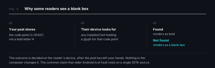
But the usual claim, that older Android devices show boxes, traces back to a single 2019 source and predates years of font coverage improvements. We could not find a verifiable recent first hand report of it. So treat tofu as a real but probably shrinking risk, and treat any article confidently asserting it as a common 2026 failure as one that has not checked. The accessibility problem above is far better evidenced and far more likely to be costing you readers right now.
One more thing about your character count
You may have read that each styled letter costs two of your 3,000 characters. The mechanism behind that claim is genuine: these characters live above U+FFFF, so in UTF-16, which is the string encoding JavaScript uses, each one occupies two code units. A naive length check counts them twice.
Whether LinkedIn counts that way is undocumented. LinkedIn publishes nothing about its counting method. For contrast, X does publish its rules and weights every non-BMP character as two. So the claim is plausible and widely repeated, but unverified, and we are not going to state it as fact when the platform has never confirmed it.
If it matters for a long post, test it rather than trusting anyone's rule of thumb. Paste a styled block, watch the counter, and see what it deducts. The same goes for the truncation point, which is a rendered height cut rather than a fixed character count, so a post with early line breaks collapses behind the more link sooner than a dense one of identical length. A LinkedIn character counter that previews where the fold lands will tell you more than counting characters ever will.
Bullets and checkmarks are a completely different thing
Here is the distinction that makes everything above tractable. Unicode bold replaces your words. A bullet point does not.
When you type a bullet character at the start of a line, the words after it are still ordinary Latin letters. Nothing was substituted. So the sentence stays readable to screen readers, matchable by search, and safe from every problem in this article.
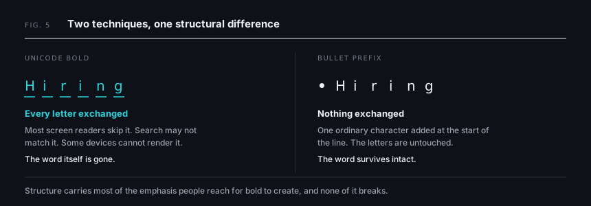
| Technique | Replaces your letters? | Inherits the problems? |
|---|---|---|
| Unicode bold, italic, script | Yes, every letter | Yes, all of them |
| Bullet character at line start | No | No |
| Manual numbering such as 1. and 2. | No | No |
| Arrows and checkmarks as prefixes | No | No |
There is a second reason these are safe. Bullets, arrows and checkmarks live in the basic multilingual plane rather than the supplementary plane, so they are single code units, they have been present in essentially every system font for decades, and they carry no realistic tofu risk.
A screen reader may or may not announce the bullet itself, depending on the listener's verbosity settings. Announcing the word bullet before a fully readable sentence is a categorically smaller problem than the sentence going silent.
The approach that actually holds up
- Structure with real characters. Bullets, numbers, arrows and line breaks do most of the work people think bold is doing, and none of them break.
- If you style anything, style the hook. One or two words at the top of a post, never a whole paragraph and never your headline.
- Keep your name, job title, skills and hashtags in plain characters, always. These have to be findable.
- Stay with bold sans or bold serif and avoid script, Fraktur and double struck, which have the alphabet gaps.
- Preview before publishing, and check on a phone as well as a desktop.
- When you genuinely need headings, real bold, real lists and blockquotes, write a LinkedIn article instead. The formatting is officially supported there and none of this applies.
That last point is the one most people miss while hunting for a better converter. LinkedIn already built the thing you want. It is just attached to a different publishing surface.
Frequently asked questions
Why does Ctrl+B do nothing in a LinkedIn post?
Because the post composer has no formatting toolbar to trigger. LinkedIn's help documentation for posts lists no text formatting capability at all. The article editor is where the real bold button lives.
Why did only some letters turn bold?
Twenty four positions in the relevant Unicode block are unassigned, mostly in script, Fraktur and double struck capitals, plus italic lowercase h. Converters that do not handle these correctly leave gaps. Switch to bold sans or bold serif, which are complete.
Will bold text hurt my reach?
Nobody has published evidence of a reach penalty, and we are not going to invent one. The documented costs are different: readers using most screen readers get silence, Braille display users get placeholders, and a growing number of people now read heavy Unicode styling as a sign that a post was machine generated.
Can screen readers read LinkedIn bold text?
Mostly no, and not in the way you have been told. In 2025 testing, JAWS reads it letter by letter, TalkBack reads it normally, and NVDA, VoiceOver and Narrator skip it entirely. Silence is the most common outcome.
Why will my headline not save?
The headline field is reported to reject stylized Unicode at submission, returning an invalid characters error, while other profile fields still accept it. Retype the headline in plain characters.
Is Unicode bold searchable on LinkedIn?
Genuinely unclear. The only public test is from 2019 and says no, some recent user reports say yes, and LinkedIn documents nothing. Keep anything that needs to be found in plain characters and the question stops mattering.
Why does my formatting disappear when I paste from Google Docs?
The composer takes text content rather than rich text runs, so the styling information is dropped on arrival. Unicode substitution survives that paste precisely because it is text rather than markup, which is also why it inherits every problem described above.
The takeaway
LinkedIn formatting fails because the characters involved were never meant to format anything. Unicode says so in writing. Once you accept that, the fixes are simple: style sparingly and only at the top, structure with bullets and line breaks instead, keep everything searchable in plain letters, preview before you publish, and move to the article editor when you need formatting that genuinely works.
The goal was never bold text. It was getting read.